
In which the practice of taking copious numbers of screenshots justifies itself.

I don’t want this to be thought of as an analysis piece, but as the continuation of an evolution of perspective I’ve been going through since I watched Gundam Unicorn and the Macross Frontier films. In a way, Garo: Divine Flame (the sequel film to the 2014-2015 TV anime series, Garo: Hono no Kokuin, directed by Yuichiro Hayashi) is a worthy successor to its two predecessors in this chain, seeing as the Makai Knights are basically giant robots—with eyebeams and all—once they transform. But that has nothing to do with what this post is really about; rather, it’s the visual world that said mecha wannabes inhabit that demands our attention.
Part 1 – How Garo: Divine Flame Speaks
Hayashi’s work on the Garo TV series was good (he storyboarded 8 episodes himself), and looking back it’s easy to see the seeds of the distinct visual vocabulary Garo: Divine Flame adopts in his work there. As an intellectual conclusion, this is interesting, but it pales compared to the stunningly immersive experience of actually watching the film. Seeing Divine Flame—and I mean literally “seeing” it with your eyes—is like hearing the movie speak. Language is a common metaphor for cinematography (I’ve already used it once myself in this paragraph), but as I watched the film I felt I finally understood this in a more profound way than ever before.
If the creation of image on screen is a language, then Garo: Divine Flame is a poet—for it’s command of said language is vast, thorough, inventive, and beautiful. An non-exhaustive selection of the film’s favourite turns of visual phrase follow.

I. Lines, Shapes, Geometry
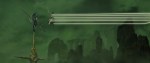
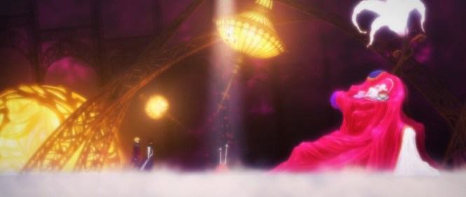
This film and its obsession with bridges, stairs, and arches is something else. It’s one thing to like a particular style of architecture; it’s another entirely to make sure that you’re using that same image throughout the entire film (the selections below are scattered from the beginning of the film all the way through the end). On its own this is something, but it also fits into a larger dialect Divine Flame taps into, which is the use of strong lines and shapes. The bridges just happen to combine both of these things because they always get used in long shots where the walking surface cuts through the middle of the shot.


But you can take away the shape parts and just leave the lines and still get some truly dynamic images thanks to the way lines can lead the eye through the frame and imply motion. In particular I’d note that the first, third, and fourth screenshots are all moments of stillness following a motion, and that the preceding movement is exactly what you’re probably thinking it is. The second and sixth screenshots express motion-to-come, and likewise, you know what to expect thanks to the composition.
Also relevant is the fact that with shots like the fourth you also get shapes anyways, so it’s not as clean cut a distinction as the categorization of this post implies.


And then, you’ve got just shapes on their own, for which I’ve only got two screenshots because that all I bothered to grab. But there are circles, implied circles, squares, arches, triangles, and whatever else all throughout the film.


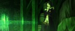
II. All the Colors, and All of the Lights
I made fun of Pacific Rim a while back because of its heavy (over)reliance on the memetic blue/orange color combination. I loved Pacific Rim, but someone needs to tell del Toro that there are other colors in the world (and while you’re at it, send that memo to Takuya Igarashi, too, as Bungo Stray Dogs did the same thing). I don’t have an ingrained dislike of blue and orange, but heavens is it nice to see a film that actually uses the full spectrum of the rainbow—and to beautiful effect.
I have taken the liberty of selecting seven shot from Garo: Divine Flame, each of which correspond to a color of the rainbow.

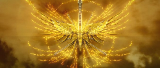


While it’s true that the blue/orange contrast does show up at times, I’m grateful that the film never resorts to ping ponging back and forth between the two colors ad naseum (and even leans into other pairs of colors at times). Instead, it reserves the recognizable contrast for relevant moments like the shift from the heat of the burning castle to the chill of what remains after it (and the passion that accompanied it) have been reduced to ashes.
Divine Flame is also bathed in beautiful and varied lights, making gorgeous use of sources both natural and supernatural. In some moments subjects are lit by the glow from inhuman creatures, magic, the sun or moon, isolated lamps, and even non-lights like the dank murk of an ugly green mist. The sheer, consistent inventiveness of the lighting is astounding, as is the film’s grasp of variation within larger categories (not all magic light looks the same, different times of day are clearly different).


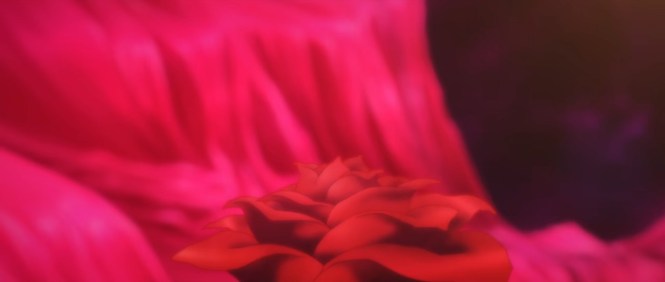
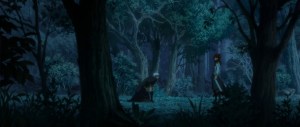
III. The Beauty of Nothing: Negative Space
There’s a general kind of way you can split a composition in half, which basically just gives two different subjects equal positioning in the screen, and then there’s the way Garo: Divine Flame splits the screen, which uses vast swathes of negative space (often, the sky) separated by hard lines to make the subjects pop from the screen.
This isn’t to say that this is the only way Divine Flame uses negative space to create attractive compositions, but it’s certainly the one that’s most visually arresting.


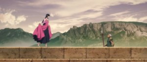
IV. On Distant Stagecraft and Immediate Motion
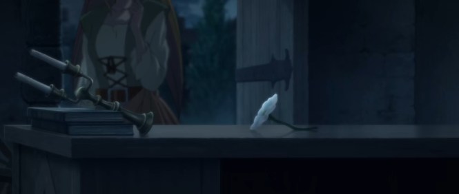
This is two categories rolled into one because they present a nice duality within the film and because this post is getting long. The dramatic stylings of Divine Flame lend themselves well to flat layouts and careful blocking techniques that ape the feeling of the stage, an effect achieved as often through sparse locations and foreground elements as shots that use the ground or other parts of the shot to create a frame within a frame.
In parallel, Divine Flame also incorporates numerous close-up shots, offering in contrast to stage-like techniques that create dramatic distance viscerally immediate closeness that breaks through the artifice of theater to draw the audience into a single action. And while the selections below stand out more as isolated moments, it’s worth noting that close-ups pervade the film’s action sequences to marvelous effect as well (as seen in the opening seconds of this sequence).
Near and far… there is a sort of harmony there…


Part 2 – Two Languages Need Not Mean the Same Thing: How Should We Understand Visual Storytelling?
I knew I wanted to talk about the visuals in Garo: Divine Flame as soon as I finished the movie, but I wasn’t quite sure how I wanted to talk about them at first. Scale of doing the project aside, I knew I wasn’t interested in doing the same kind of cinematography close readings I did for shows like Hyouka and Blood Blockade Battlefront. That kind of analysis just didn’t seem to be appropriate for something like this movie. I don’t mean this as a pejorative towards the Garo film, but there was a kind of intricacy to the cinematography of those two shows that was replaced with a far more sweeping and wide-reaching cinematography in Divine Flame. To put it another way, Hyouka and Blood Blockade Battlefront are exercises (very complete ones at that) in very precise cinematography. Divine Flame paints with broader stokes.
Part of why this is so perhaps derives from the fact that the stories being told in these three works are different. Both Hyouka and Blood Blockade Battlefront (particularly the former) deal with complexities of characters and situations that Garo: Divine Flame either has no time or no inclination for. So in assessing the quality of the the two TV series’ use of visual language, it can be said to be good because the visual and written elements work in unison to convey information to the audience. There is an acute harmony there.
The subtext here, though, is that good visuals are made “good” when they back up the story well—and the cinematography of both these TV anime can be said to do this. But this further implies that the story is the main feature. Remove the story and leave all the visual elements and you have something that looks evocative and pretty, but doesn’t “mean” anything. Right?
Before watching the Garo movie, I might have been inclined to answer yes (in fact, I think I said as much in the piece I linked earlier on Gundam Unicorn and the Macross Frontier films). But having seen Yuichiro Hayashi’s masterpiece, I conclude that even had I watched it with no sound and no subtitles, I would have found it compelling. The visual language is just that good.
Subtitle of this section be damned, I’m deliberately avoiding the phrase “visual storytelling” when talking Garo: Divine Flame for a reason—because I don’t necessarily think the idea of a story is the best paradigm for understanding why the film’s visuals work the way they do. Earlier in this piece I used the analogy of poetry for Divine Flame‘s visual language, and I find that a fitting distinction to draw between what it is that this film is doing and what something like Hyouka‘s cinematography is doing. In essence, it’s a matter of priority.
Where Hyouka seeks to use its visuals in equal complementarity with its story, Garo: Divine Flame‘s style seems to me to be more like a visual aria being sung over the story (with Blood Blockade Battlefront existing somewhere in the middle). Rather than each shot adding a bit of texture here or a tiny increase in understanding of the characters there in painstaking detail, the cinematography of Divine Flame dumps buckets of gorgeous paint over the canvas of the film. The numerous specific techniques (some of which I’ve highlighted above) certainly contain “information” of a sort, but to only encounter each individual shot through the constant question “what does this mean?” ultimately fails to understand the film’s goals or offer a suitable methodology for appreciating its successes. The many shots that make up this film don’t have mean anything, and they certainly don’t demand to be shackled to the film’s (merely) serviceable and enjoyable story.
The visuals justify themselves, on their own terms and for their own sake. What say you, Leon?

Thanks a lot for this post. Long time lurker first time poster here. I’ve just watched the film and it was one of the most beautiful anime films I ‘ve ever watched. It’s such a pity that the Garo franchise is largely ignored by the fandom because the first season and this film are hands down the best pure fantasy anime series/film we have had this decade
LikeLiked by 1 person
Thanks for coming by and reading! It definitely is a shame the film will probably go unwatched by nearly all fans in the West… it’s just a gorgeously done piece of art.
LikeLike